

As someone who has reviewed countless therapist websites over the years, I’ve noticed a few recurring mistakes that are surprisingly easy to fix.
Let’s look at some common pitfalls and simple tips to help you create a welcoming and professional online presence.
1. Overly Busy Color Palettes or Harsh Colors
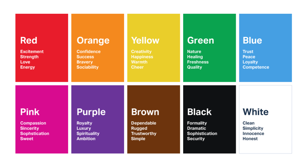
Imagine visiting a therapy website and being greeted by bold red headings. Would you feel calm and confident about opening up during a session later? Probably not.
Just as you wouldn’t paint your therapy room in jarring colors, your website should also evoke a sense of tranquility and trust.
Tips:
- Stick to 2-3 colors: Choose one primary color and one or two complementary shades. Tools like Coolors can help you find a harmonious palette.
- Avoid harsh or overly bright colors. Dive into color psychology to understand how certain colors can evoke specific emotions and behaviors.
2. Lack of white space
White space refers to the breathing room between different sections of your website. It doesn’t have to be literally white—it just needs to be free of content. Many websites I’ve seen feel cluttered because they lack this visual balance.
Proper use of white space can:
- Make your content easier to read
- Create a sense of balance and professionalism
- Help guide visitors through your website smoothly
Tips:
- Maintain consistent spacing between sections for a clean look.
- Check out my sample therapist website to see how strategic white space enhances readability and professionalism.
3. Hard-to-Read Text
Background images can look stunning, but they can also make your text difficult to read if not handled carefully. For instance, dark or busy backgrounds can clash with black text, making it a struggle to discern your message.
Look at the example below. We placed black text on a fairly busy image, that has multiple colors, and is quite dark. In the meantime on the right side, we have much more contrast between the image and text, and can read the content without any issue.

Tips:
- Use simple, less busy images as backgrounds and ensure they contrast well with the text.
- When in doubt, opt for solid-colored backgrounds with high contrast to make your text stand out.
4. Missing Calls-to-Action (CTAs)
You might wonder, “Why are CTAs so important?” Let’s say a potential client finds your website and loves what they see, but it takes them too long to figure out how to contact you or book a session. They might leave before taking action.
Every website should have a clear goal—whether it’s booking a call, signing up for a newsletter, or purchasing a course. CTAs make it easy for visitors to take the next step.
Tips:
- Define your website’s primary goal. For example, is it to book an introductory call?
- Place a clear, prominent CTA on your homepage, ideally near the top.
- Repeat your CTA strategically across your site—for example, under blog posts or on service pages.
Need Help with Your Website?
If you're ready to elevate your online presence without the tech overwhelm, let’s work together. Contact us to create a website that reflects your professionalism and makes it easy for clients to connect with you.